Designing Clarity in Accessibility Testing
Accessibility work shouldn't require three tools, a spreadsheet, and a prayer. It should be fast, in context, and something your whole team can act on.
Project Overview
Completing a full VPAT in a previous role changed how I think about accessibility. Not because the issues were hard to find, but because everything that came after was. Cross-referencing findings across multiple tools. Translating technical violations into language that meant something to stakeholders. And then the part that was the most frustrating: watching developers deprioritize issues that felt urgent.
"That's an edge case, we'll fix it later." "That's not a real blocker for users." These weren't bad-faith responses. They were the predictable result of a broken handoff. When accessibility findings are abstract, scattered, and hard to verify in context, they stay on the backlog.
The tool didn't exist that could surface issues clearly, in context, in a format anyone on the team could act on. So we built it.
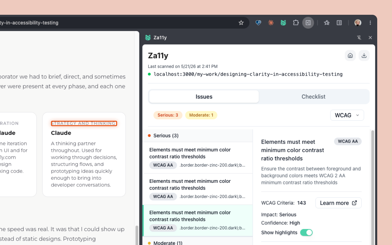
Za11y (pronounced 'Zall-eye') is a fast, lightweight Chrome extension that helps teams find and understand accessibility issues directly in the browser, without the complexity of traditional accessibility tools. It works on any website or app, stores no user data, and delivers clear, actionable results in seconds. View Chrome extension here.
Challenges
- Translating complex WCAG criteria into insights that are immediately useful to non-experts
- Designing for three distinct users, designers, developers, and QA, whose needs and expectations from the same tool differ meaningfully
- Balancing on-page highlighting with visual noise, making issues visible without disrupting the page being tested
- Bridging automated scanning with manual testing in a single coherent workflow
- Designing within the strict UI constraints of a Chrome extension side panel
Who It's For
Za11y was designed for three people: the designer doing a pre-launch audit, the developer who needs to verify a specific element, and the QA engineer building a compliance report. The challenge was creating one tool that respected each of their contexts without compromising for any of them.
Design Thinking
I started by mapping the object matrix and user flows to define what each role needed from the tool and how they'd move through it. This grounded the five design decisions that follow in real workflow thinking rather than assumptions.
Translating accessibility complexity into usable insights
Accessibility violations are technical by nature. WCAG criteria, success levels, and failure techniques are precise language for auditors but noise for most designers and developers trying to move fast.
Decision
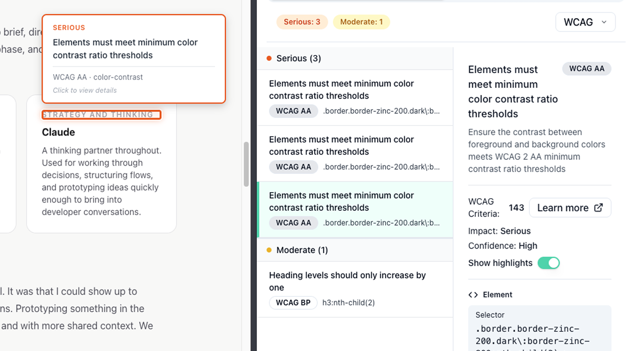
I paired plain language descriptions with contextual highlighting, so every issue is explained in terms of what it means and shown exactly where it lives on the page. Understanding the problem and locating it happen in the same moment.
Designing for designers, developers, and QA
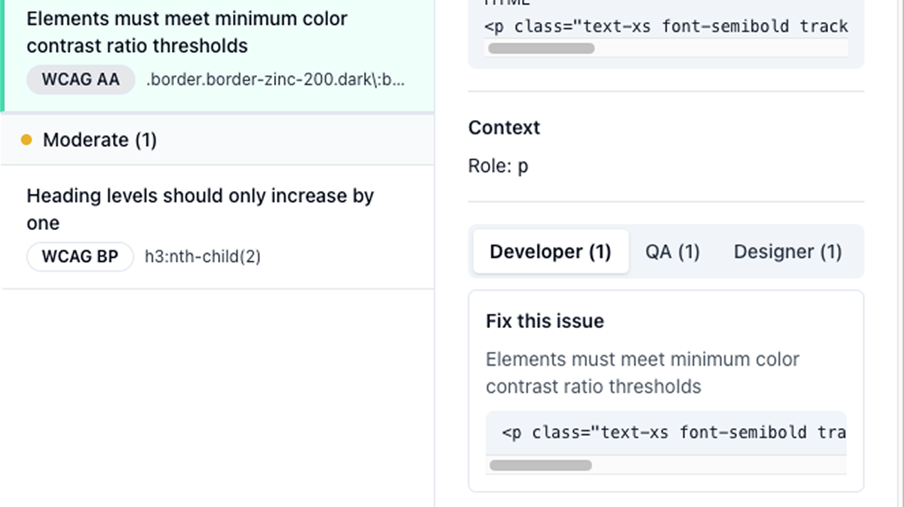
Each role approaches accessibility from a different angle. A designer wants to understand the visual and experiential impact. A developer wants to know what to fix and where in the code. A single undifferentiated results view serves neither well.
Decision
I introduced role-specific views and filters so each user can orient the results around what they actually need. The underlying data is the same, the lens changes based on who is looking.
Balancing visibility vs UI noise on-page highlighting
Highlighting every issue at once creates visual chaos on complex pages. But hiding highlighting entirely removes the contextual value that makes the tool useful in the first place.
Decision
I made highlighting per-issue and user-initiated rather than automatic. Selecting an issue activates its highlight, keeping the page readable while preserving the ability to locate any specific element on demand.
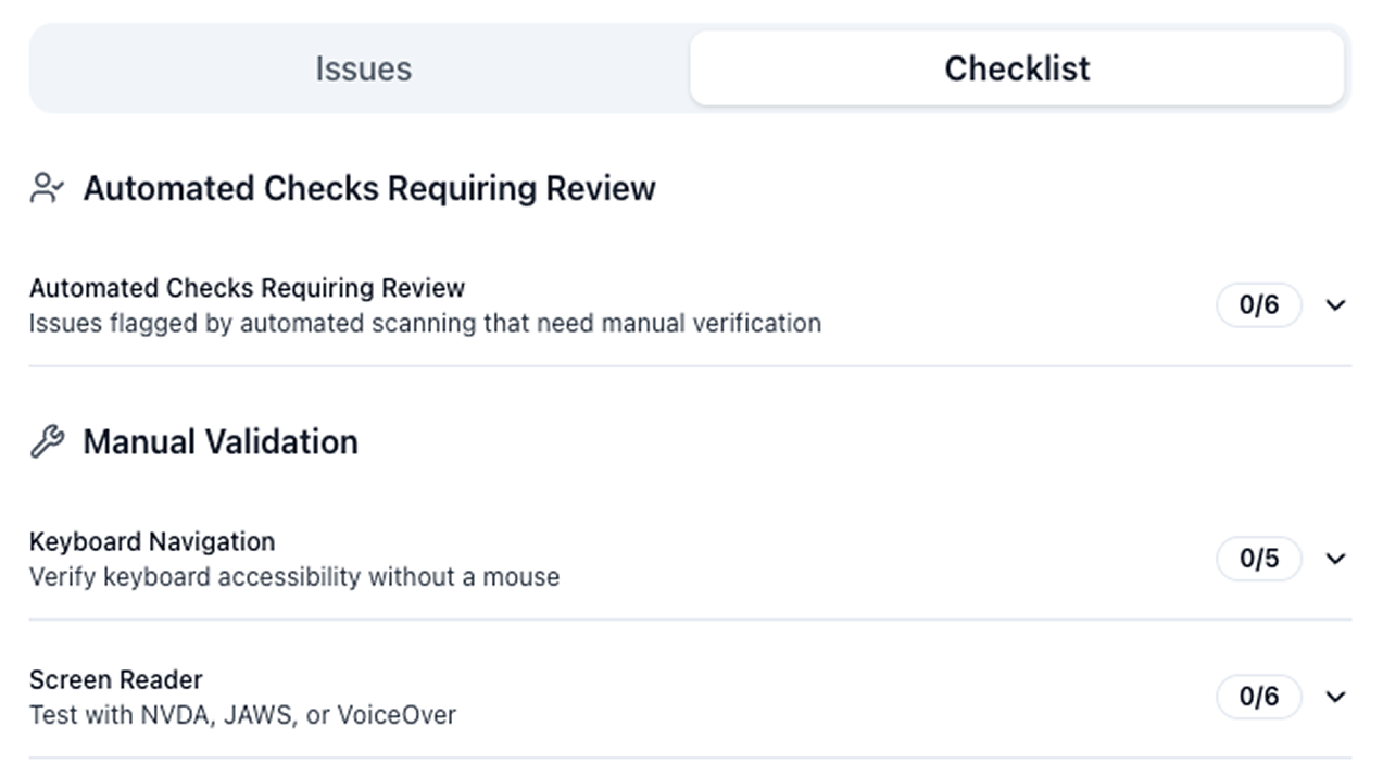
Bridging automated and manual testing
Automated tools catch a real but limited subset of accessibility issues. Presenting automated results without acknowledging that gap creates a false sense of completeness, which is a real problem for teams doing compliance work.
Decision
I separated automated results and manual checks into distinct tabs, made the UI explicit about what automation can and cannot catch, and designed the manual checklist to complement rather than duplicate the automated findings. The two work together as a complete picture, not as overlapping lists.
Designing within Chrome extension constraints
Za11y opens as a side drawer rather than a popup, which gives more flexibility than a traditional extension but still comes with real constraints. Width is bounded by a maximum and height is limited to the viewport. Users can scroll to see more, but the order and hierarchy of information matters. What appears before the scroll has to earn its place, and getting that priority right was the central layout challenge.
Decision
I used progressive disclosure for issue detail, expanding inline within the results list rather than navigating to a separate view. This keeps the most important information visible before the scroll while giving users access to full issue context without losing their place in the list.
How I Used AI
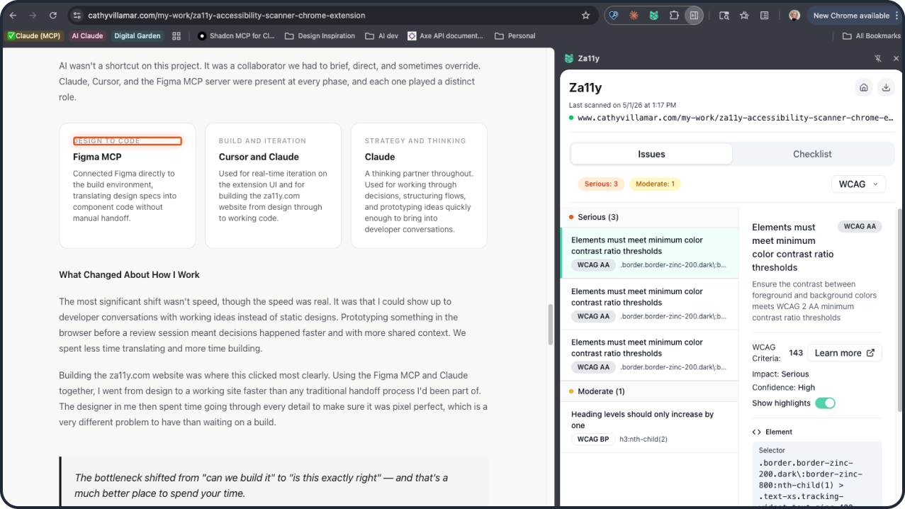
AI wasn't a shortcut on this project. It was a collaborator we had to brief, direct, and sometimes override. Claude, Cursor, and the Figma MCP server were present at every phase, and each one played a distinct role.
Design to code
Figma MCP
Connected Figma directly to the build environment, translating design specs into component code without manual handoff.
Build and iteration
Cursor and Claude
Used for real-time iteration on the extension UI and for building the za11y.com website from design through to working code.
Strategy and thinking
Claude
A thinking partner throughout. Used for working through decisions, structuring flows, and prototyping ideas quickly enough to bring into developer conversations.
What Changed About How I Work
The most significant shift wasn't speed, though the speed was real. It was that I could show up to developer conversations with working ideas instead of static designs. Prototyping something in the browser before a review session meant decisions happened faster and with more shared context. We spent less time translating and more time building.
Building the za11y.com website was where this clicked most clearly. Using the Figma MCP and Claude together, I went from design to a working site faster than any traditional handoff process I'd been part of. The designer in me then spent time going through every detail to make sure it was pixel perfect, which is a very different problem to have than waiting on a build.
The bottleneck shifted from "can we build it" to "is this exactly right" — and that's a much better place to spend your time.
Where It Got Tricky
AI-generated code that looks right isn't always right. There were moments where Claude produced output that conflicted with our existing component structure, and others where the Figma MCP translation introduced spacing and layout errors that were subtle enough to miss if you weren't looking carefully. In both cases, catching the problem required designer judgment: something felt off visually before I could articulate why technically. The fix was usually a combination of describing the problem precisely back to Claude and correcting it visually in the output. That back-and-forth loop is real work, and it's where experience matters. AI moves fast, but you still have to know what good looks like.
Screenshots of the Extension


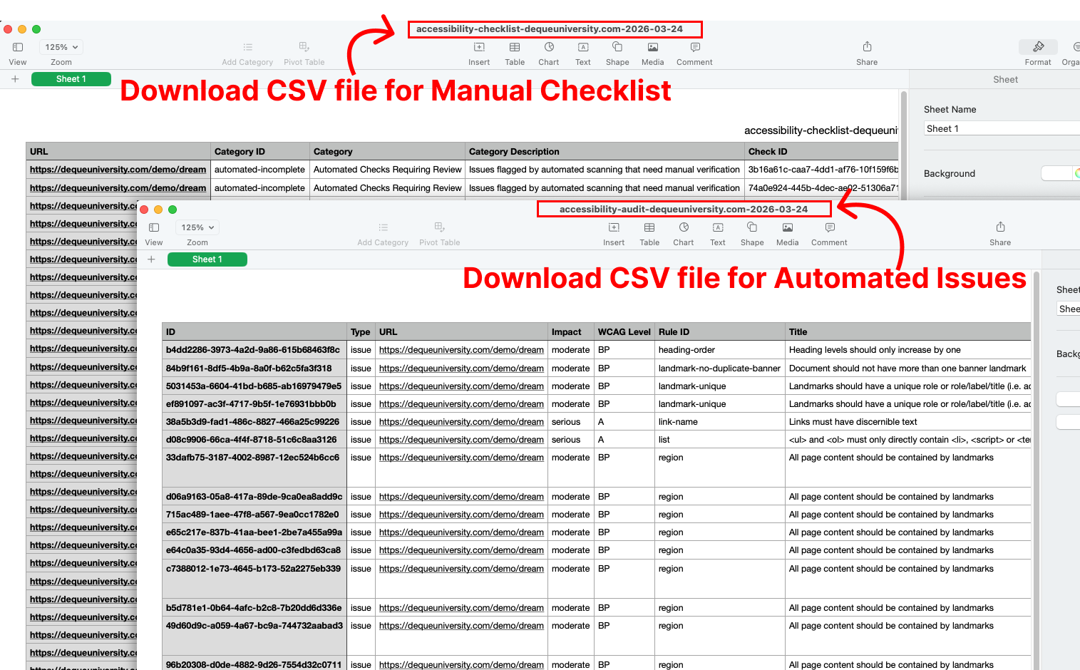
Download Your Results
Accessibility work doesn't end at identifying issues. Teams also need a clear way to document progress, share findings, and demonstrate compliance, and that part of the workflow is often where things fall apart. We designed the export feature to translate scan results and manual checks into structured, usable data that supports the full cycle: tracking remediation, collaborating across teams, and producing the documentation that compliance deliverables like VPAT reports actually require.
Collaboration & Build
Bringing Za11y from design to a shipped Chrome extension required close partnership with a developer throughout, not just at handoff. We made decisions together: what made it into the MVP, how results should be structured, where to draw the line between clarity and feature complexity. Those conversations shaped the product as much as the design work did.
Working with an engineer also pushed me to think differently about my own role. I came to reviews with working prototypes instead of static designs, which changed the quality of the decisions we made together. When something needed to change, we could see it and test it rather than debate it in the abstract.
Exploring Future Iterations
Shipping an MVP meant making deliberate calls about what to leave out. Two features we designed but held back:
Dark mode We built a full dark mode design but cut it before launch to keep the initial release focused. It's the most requested addition and the most ready to ship.
Notes on individual issues Adding notes per issue would meaningfully improve collaboration and reporting workflows, particularly for teams producing VPAT documentation. We scoped it out to avoid overcomplicating the first version of the results view.
Za11y Branding
Chrome extension submissions require a live website and privacy policy, which gave me the push to build something I'd been wanting anyway. I developed the full Za11y brand from scratch, including the logo, typography, color system, and the Za11y cat mascot, all visible in the UI kit below. Using the Figma MCP server and Claude, I went from design to a working marketing site faster than any traditional handoff process I'd been part of before. It also pushed me past a real barrier: I'm now comfortable in the terminal in a way I wasn't before this project. The designer in me then spent a good amount of time making sure every detail was pixel perfect.
Explore the Za11y website and Chrome extension.
Final Thoughts
Za11y started as a solution to a problem I'd lived through. It became something bigger: proof that a designer can own the full arc of a product, from identifying the problem through shipping the thing that solves it. That's the kind of work I want to keep doing.