Reducing Friction in Pet Care Scheduling
A streamlined dog-walking app designed for fast, stress-free scheduling, supported by custom illustrations adding personality and visual consistency to the experience.
Project Overview
Booking a dog walker should be simple, but most apps make it harder than it needs to be. This self-directed project explores how a focused mobile experience could get dog owners to a confirmed booking in just a few steps, keeping the focus on what they actually need in the moment.
Challenge
- The tension between showing enough caregiver information to build trust without overwhelming the user before they've even committed to booking
- Deciding how much information to collect upfront versus progressively, knowing that too many fields kills conversion
- Designing for a two-sided marketplace dynamic where owner needs and caregiver needs can conflict
Design Process
Marketplace Research
Researching existing pet sitting and dog walking apps for inspiration, insights, and to better understand user pain points through marketplace app reviews.
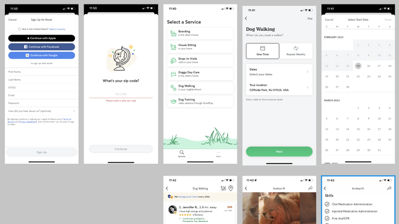
Dog walking app market research screenshot
App store reviews revealed that trust and last-minute availability were the most common pain points across competing apps.
View full research board in Figma
Jobs-to-be-Done analysis informed the core booking flow and caregiver trust features
User Personas
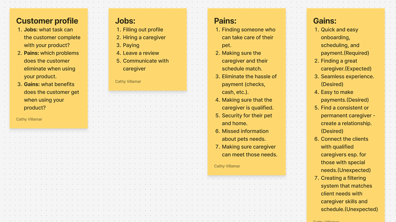
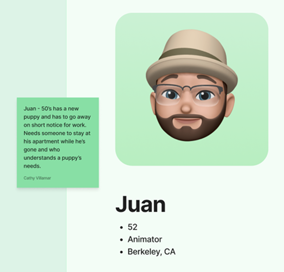
Building on marketplace research, I synthesized this information to create distinct user personas based on user values and priorities to guide design decisions.
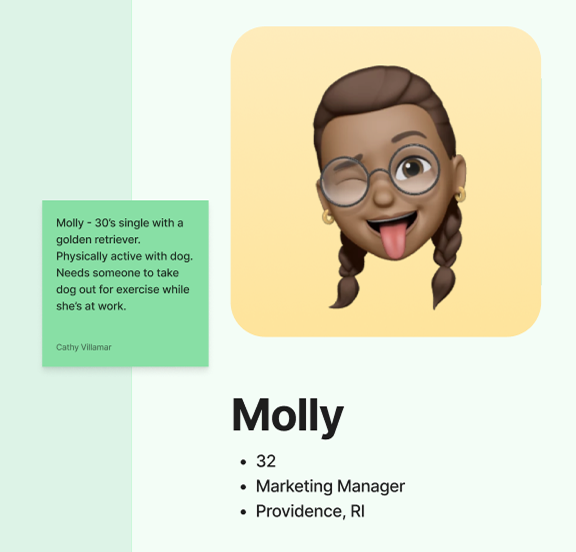
Books last-minute and needs to find someone fast, drove the decision to show available caregivers before asking for account details
Concerned about his dog's specific needs, informed the dog profile step and caregiver filtering
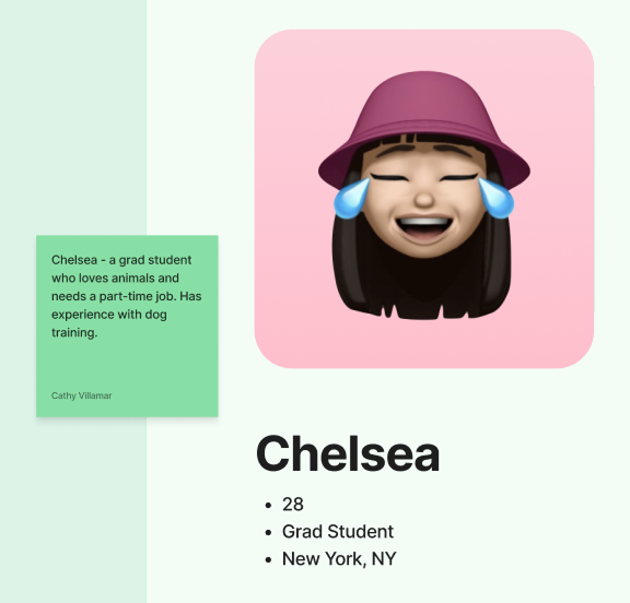
Looking for flexible part-time work as a caregiver, informing the caregiver profile setup and availability features
View full user persona board in Figma
Wireframes
Wireframes mapped out the full booking flow across five key sections: account creation, scheduling, dog profile, caregiver selection, and checkout, exploring interaction patterns, edge states, and component behavior before moving to high-fidelity design.
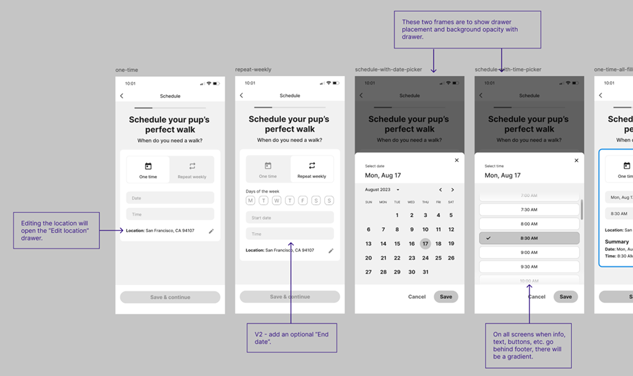
Highlighting interaction decisions, gradient treatment, and V2 considerations
View full wireframes in Figma
Color Strategy
Green was chosen as the primary color to communicate energy, playfulness, and trust, qualities that feel native to a pet-focused, activity-based app. All color combinations were tested against WCAG contrast requirements, and type weight and size were chosen to maintain readability across the interface.
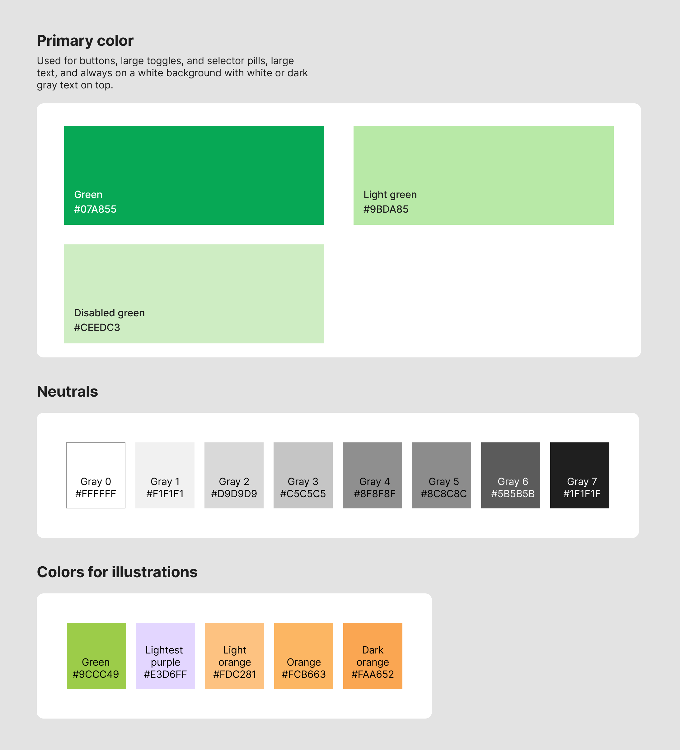
Dog walking app color strategy
Design Solution
The final designs reflect a clear, approachable, and minimal interface
- A linear, step-by-step flow built around the owner's immediate goal: get to a confirmed booking fast
- Cognitive load reduced by breaking decisions into one focused step at a time
- Trust established through caregiver profiles, clear ratings, and a calm, approachable visual language
- A checkout experience that asks for only what's essential, nothing more
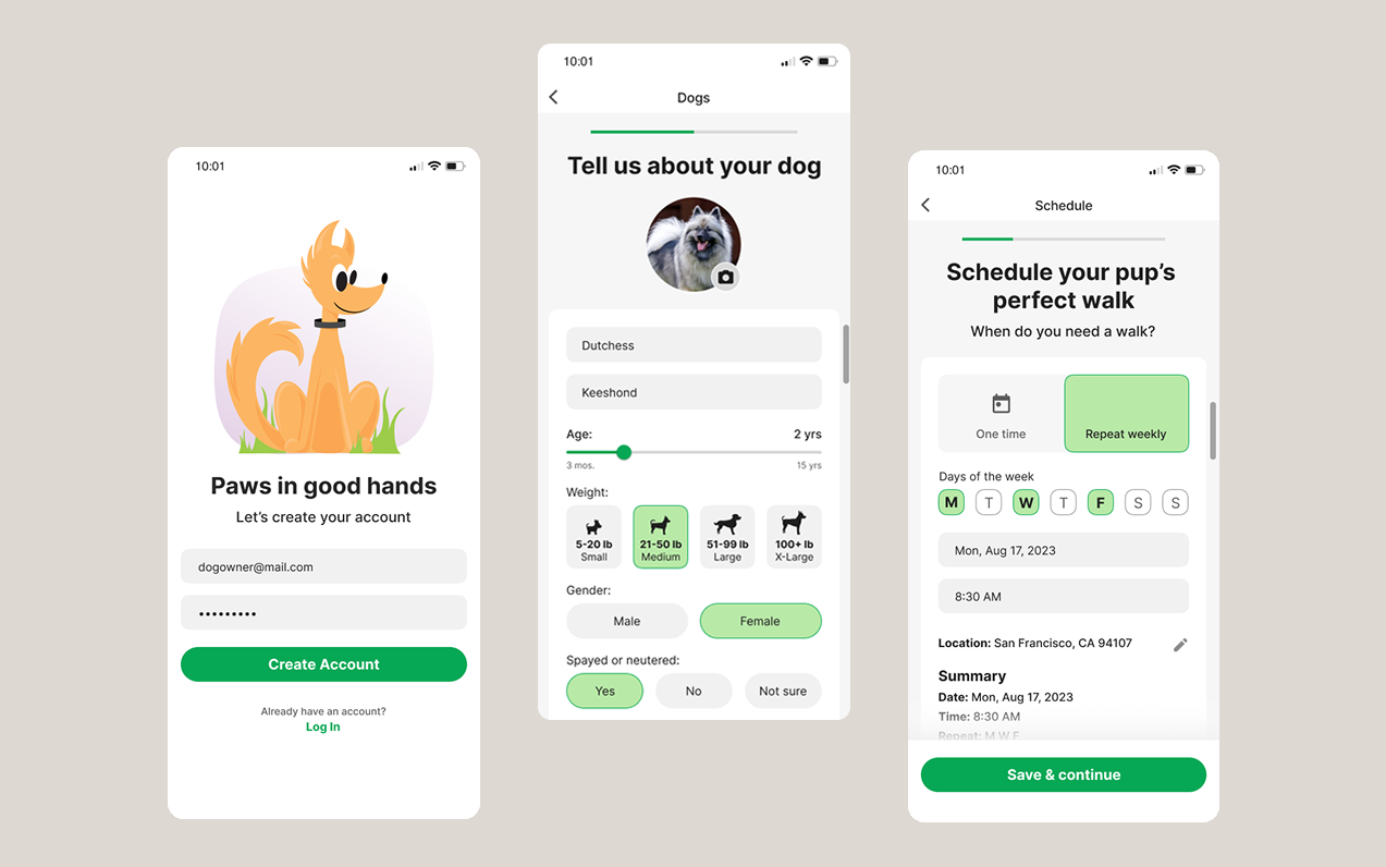
Scheduling Flow
The flow is ordered intentionally. Collecting the dog's information before surfacing caregivers allows the app to match owners with caregivers who are equipped to meet their specific dog's needs, whether that's size, breed, temperament, or special requirements. This reduces irrelevant results and builds confidence in the caregiver recommendations before the owner has to make a choice.


Repeat Scheduling and Dog Profiles
For owners who need a regular walker, the repeat weekly flow removes the friction of rebooking every week by letting them set a recurring schedule once and forget it. The dog profile system supports multiple dogs and feeds directly into caregiver matching, ensuring every booking is tailored to the right animal, not just the right time slot.


Final Thoughts
This project reinforced how much information architecture decisions shape trust.
Ordering the flow to collect dog information before showing caregivers was a deliberate bet that personalization would outweigh the added steps, something that would need to be validated with real users.
The biggest tradeoff of the MVP scope was deferring the caregiver-side experience, which Chelsea's persona made clear is just as critical to the marketplace functioning well.
The most immediate next step would be validating the booking flow with real dog owners through usability testing. From there, the highest priority features for V2 would be real-time walk tracking, which came up consistently as a trust signal in the marketplace research, and the caregiver-side onboarding experience to complete the two-sided marketplace. SSO login and social features could also follow in later iterations.