Designing Za11y's Companion Dashboard From Zero to One
Before a single screen gets designed, the real work is figuring out what's worth building. Here's how I scoped a companion dashboard for Za11y, turned the core idea into flows, and caught a few moments where the design nearly repeated the exact mistakes it's meant to catch.
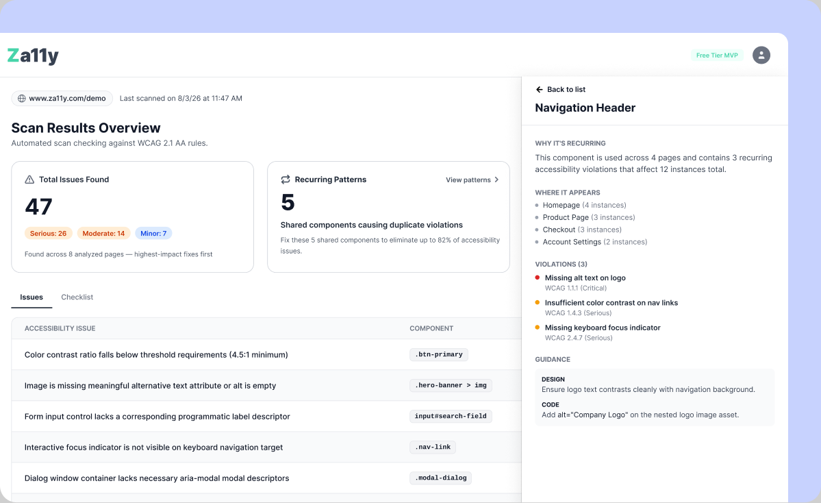
Za11y started as a Chrome extension: local-only, no account, no telemetry. Scan a page, get clear accessibility results, done. That simplicity is the whole brand. So when the idea of a companion dashboard came up, with accounts, sync, and history, my first instinct was caution. Anything that touches "no account required" has to show its value.
Starting With the Obvious Pitch, and Questioning It
The obvious pitch writes itself: sync your scans, see your accessibility trend over time. It's a good pitch. It's also everyone's pitch.
I started with the closest competitor, axe DevTools Pro, the paid product from Deque, which also makes the axe-core engine Zally uses. Then I looked at Siteimprove, Accessstive, GetWCAG, and Accessibility Tracker. Nearly all of them say some version of "track your accessibility progress over time." Even axe DevTools Pro's "spot recurring issues" comes back to an aggregate view of failing WCAG rules.
If the whole pitch is "see if things are getting better or worse," the dashboard is just a smaller version of something that already exists.
Regression tracking still had to be there. Users would expect it, and it is useful. But it couldn't be the reason the dashboard exists. I needed to find the thing none of them were saying.
Finding the Reason to Build it
The extension already reports violations page by page: a color-contrast failure here, a missing label there. But what if the same problem is showing up across eight pages because it comes from one shared component?
That changed what the dashboard needed to do. Instead of just showing that a page has 12 issues, it could group the same issue across a project and trace it back to a shared component or design token. Fix it once instead of page by page. Regression tracking becomes more useful too: did this recurring pattern disappear after the shared component was fixed?
Why this is worth building
- axe-core gives us a DOM selector and HTML snippet, not a component name, so the grouping has to happen on our side.
- Users don't need to change how they scan. We can group shared class names first and fall back to structural similarity.
- Most importantly, it gets closer to the source of the problem instead of showing the same symptom over and over.
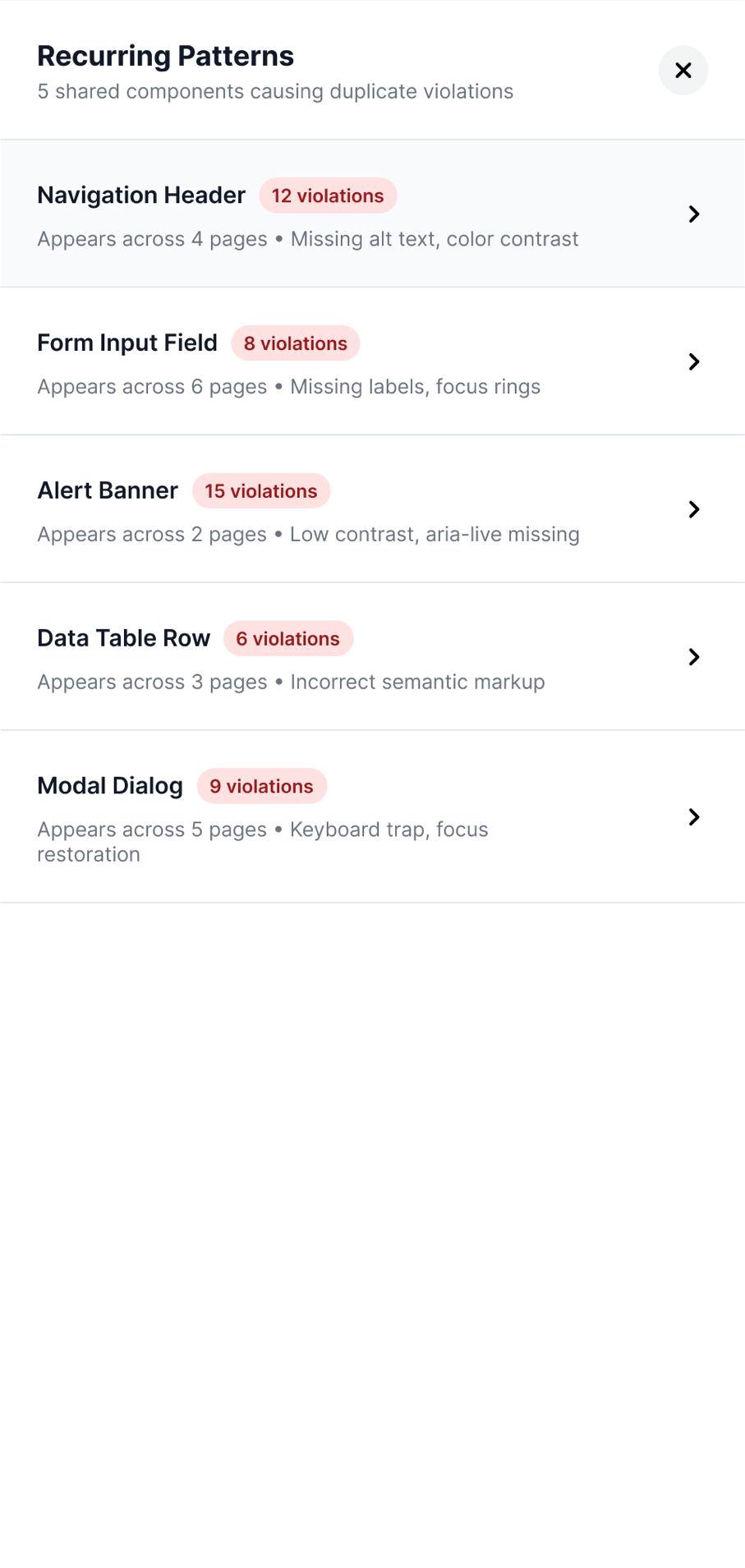
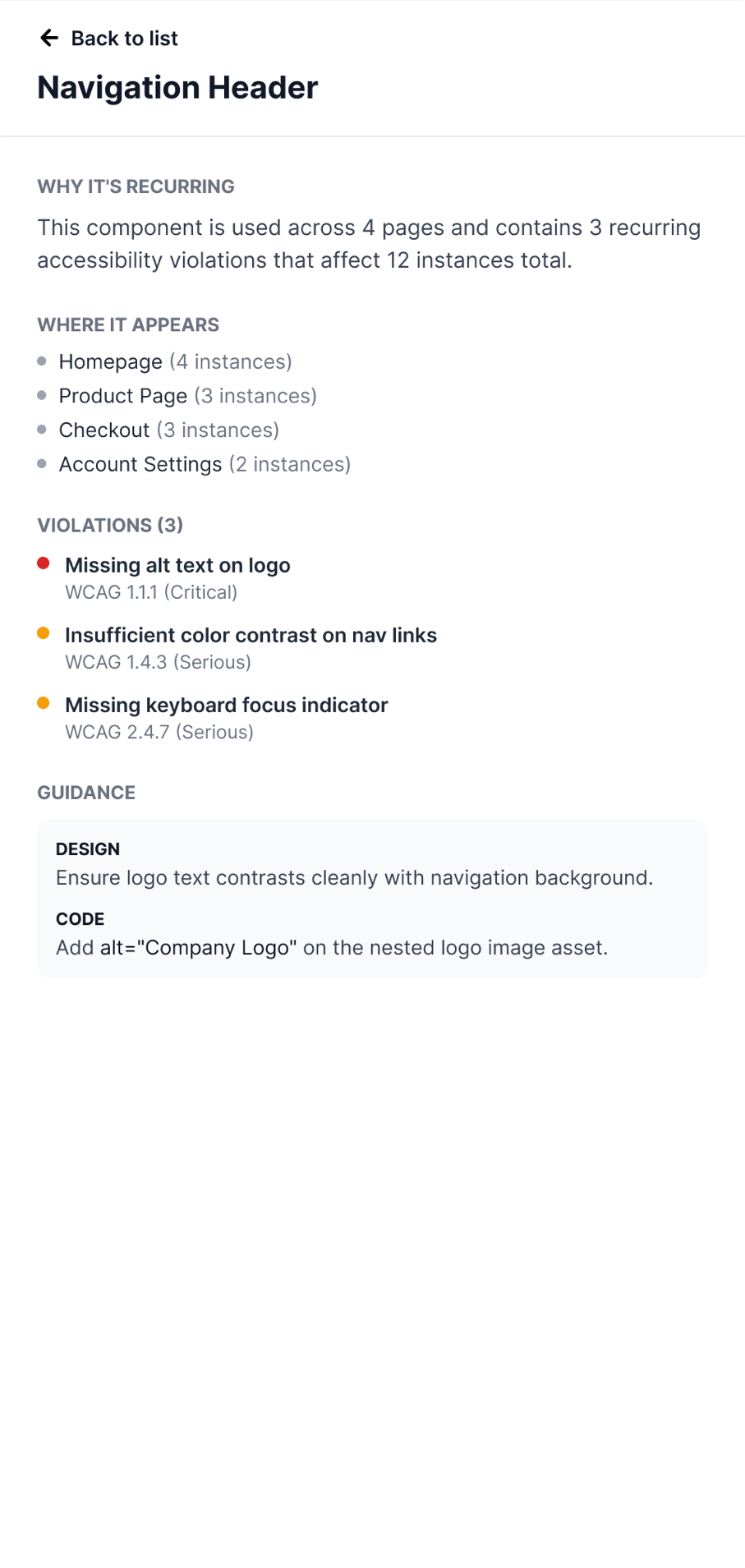
The detail view is where this becomes useful. "Navigation Header" isn't three separate line items. It's one recurring pattern showing why it's recurring, where it appears, and what needs to change.
Scoping the Boundaries Before the Screens
Once the core idea was clear, I could have started sketching screens. Instead, I worked through the data model first. Getting that wrong would be much harder to fix later.
The MVP is single-user: no sharing or invites. But I didn't want to organize scans as a flat list and have to restructure everything later when team features were added. So the model starts with Project → Page → Scan. For now, every user gets one default project and never needs to think about it. Later, sharing a project already has somewhere to live.
Decision
Build the grouping boundary now, even though nothing uses it yet. Don't build any of the sharing logic that boundary will eventually support.
Designing the Only Way In
The dashboard needed exactly one way in for the first sign in, and I didn't want it to be a separate "Sign Up" page. Sync should be something a user chooses from inside the extension, not something the dashboard pushes on its own.
That button, "View in Dashboard," is the entry point: it's in the extension's header on both tabs, not buried in a settings menu or a separate marketing page.
Decision
Google handles the sign-in flow, so the first screen I needed to design was what comes next.
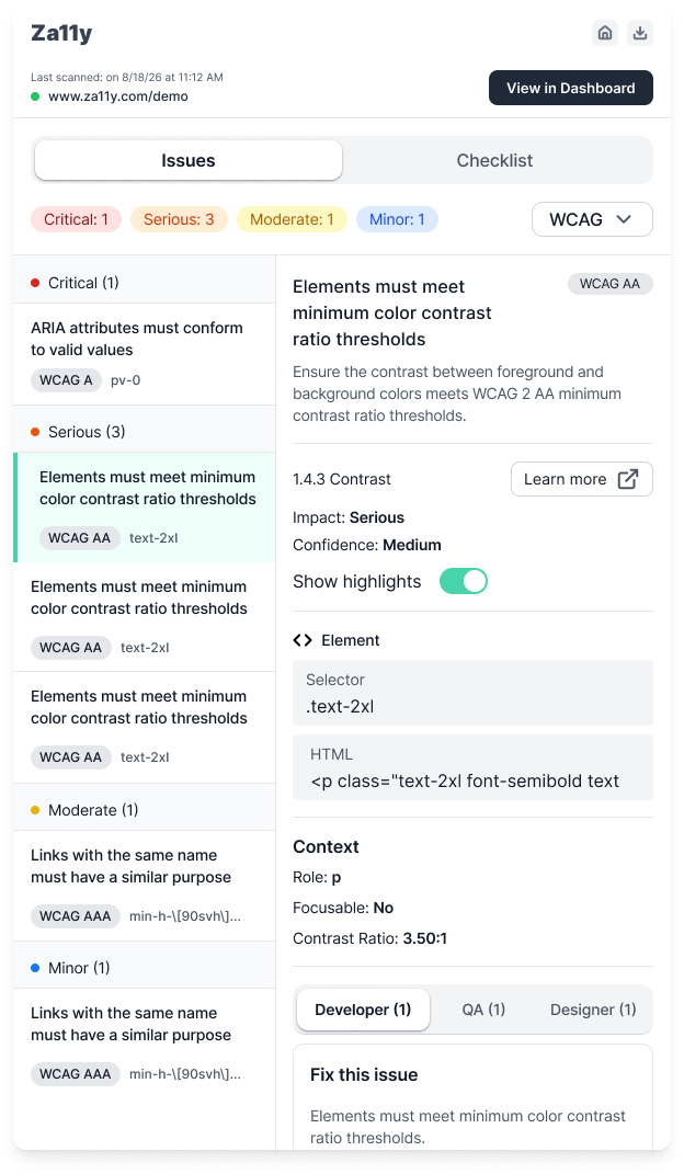
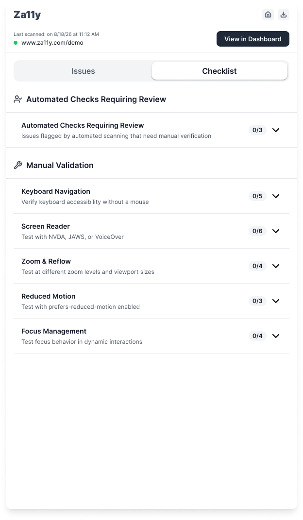
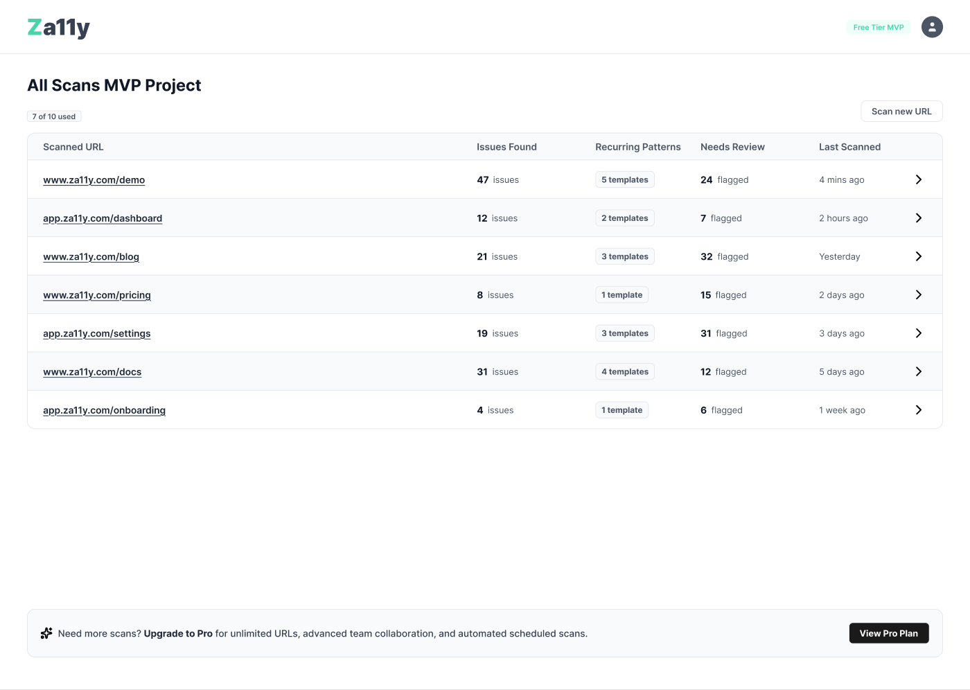
Google's own screen handles the sign-in, so there was nothing to design there. That was the point, not needing a screen for it at all. The first screen we actually designed is the one someone lands on right after.
Making the Limit a Nudge, Not a Wall
The landing screen is also where the free/paid boundary lives. A small chip shows how many pages you've used and a banner at the bottom tells you what Pro adds. What's not gated is more important: recurring patterns stay visible and clickable on every tier.
Decision
Cap pages and scan history. Never the pattern detection. The banner tells you what you're missing; it doesn't block you from seeing why you'd want it.
Turning the Core Idea Into a Loop, Not a Screen
With the data model settled, I mapped the workflow before designing individual screens: Scan → review recurring patterns → open an issue → update its status → hand it off → come back later and scan again.
The dashboard only works if that loop makes sense over time. A recurring issue might not be fixed in one sitting, and when someone comes back a week later they need to understand exactly where they left off.
The full Za11y Dashboard file
Handing Issues Off to a Ticket Tracker
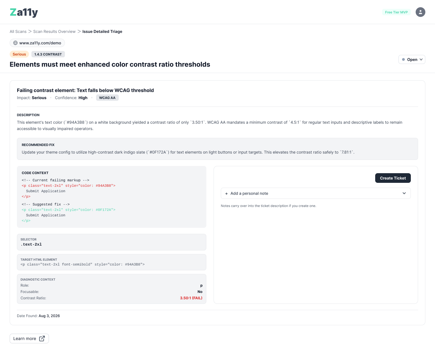
The last step in the loop is handing an issue off to a ticket tracker. "Create Ticket" opens a pre-filled modal with the issue title, description, and any notes already added, so nothing has to be retyped in Jira, Linear, or GitHub Issues.
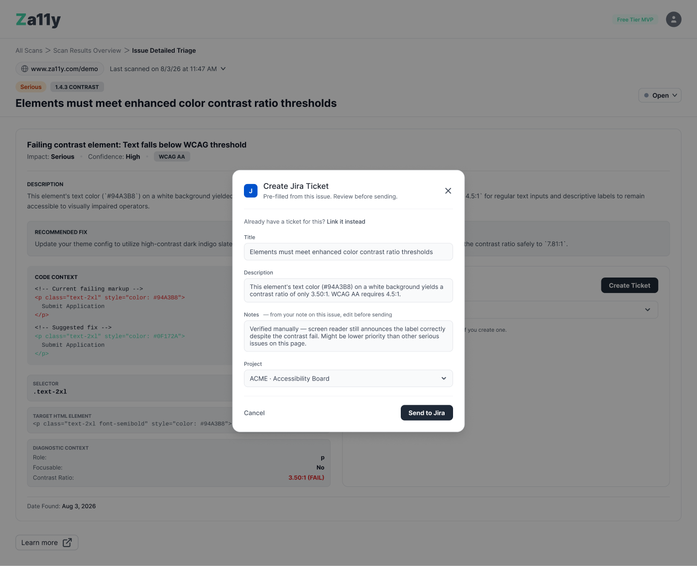
Two smaller decisions mattered more than the modal itself. If an issue already has an open ticket, Create Ticket surfaces it instead of creating a duplicate. And if the ticket started somewhere else, Link Existing Ticket lets someone connect it back to Zally.
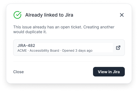
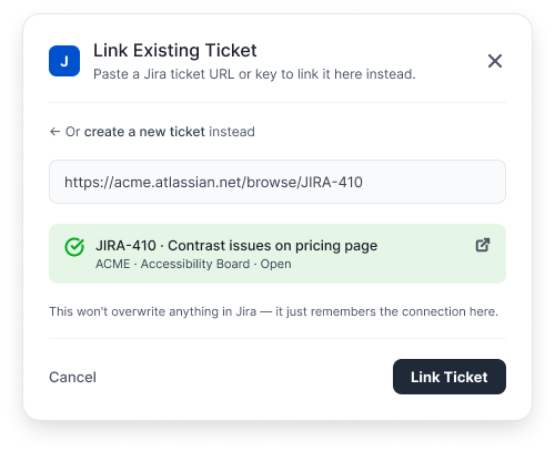
Before anything is linked, the preview makes one thing clear: "This won't overwrite anything in Jira—it just remembers the connection here."
Decision
Never let "Create Ticket" silently duplicate work, and never let "Link" silently overwrite something in the tracker. Both flows show potential conflicts before asking someone to commit.
Catching My Own Blind Spots
Once the flows were in place, I did another pass looking specifically for ambiguity: unclear next actions, interactions that only made sense if you already knew what to click, and places where I'd contradicted an earlier decision. Most of what I found was small. Four things weren't.
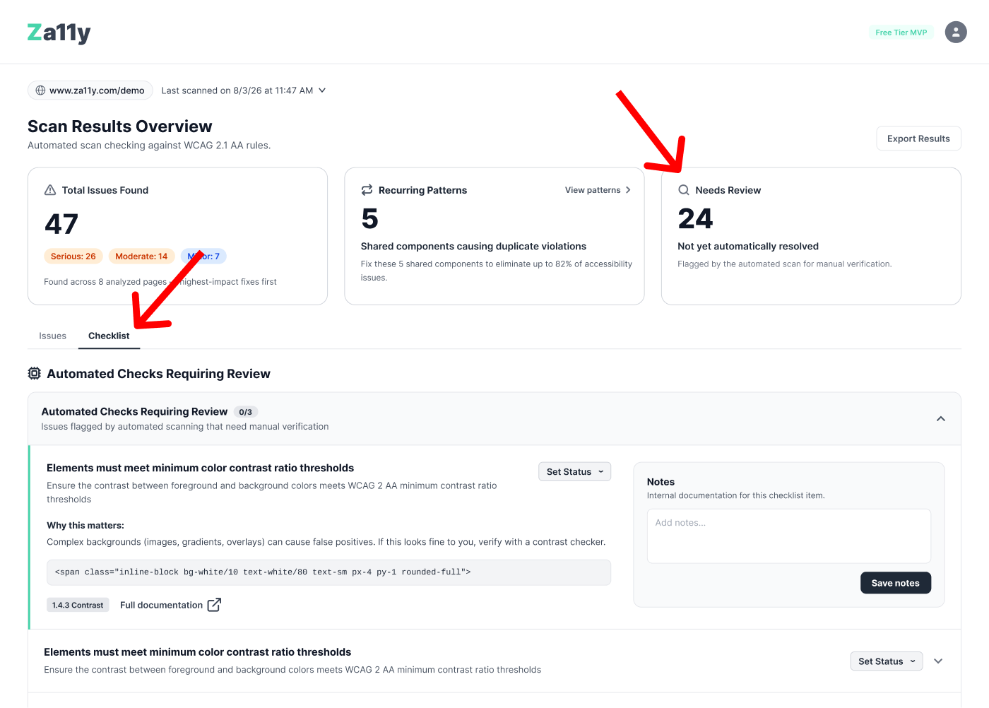
The line between “confirmed” and “needs a human”
Automated scanning only catches some accessibility issues. Zally already keeps that distinction clear: violations are confirmed by axe-core; incomplete checks still need a person to review them. My first dashboard draft combined both because the results looked cleaner that way.
Decision
Kept the split visible everywhere in the dashboard, not just in the data underneath it. A user should never have to infer from context whether a listed item was confirmed or is waiting on their own judgment.
A status model with room for “not my call”
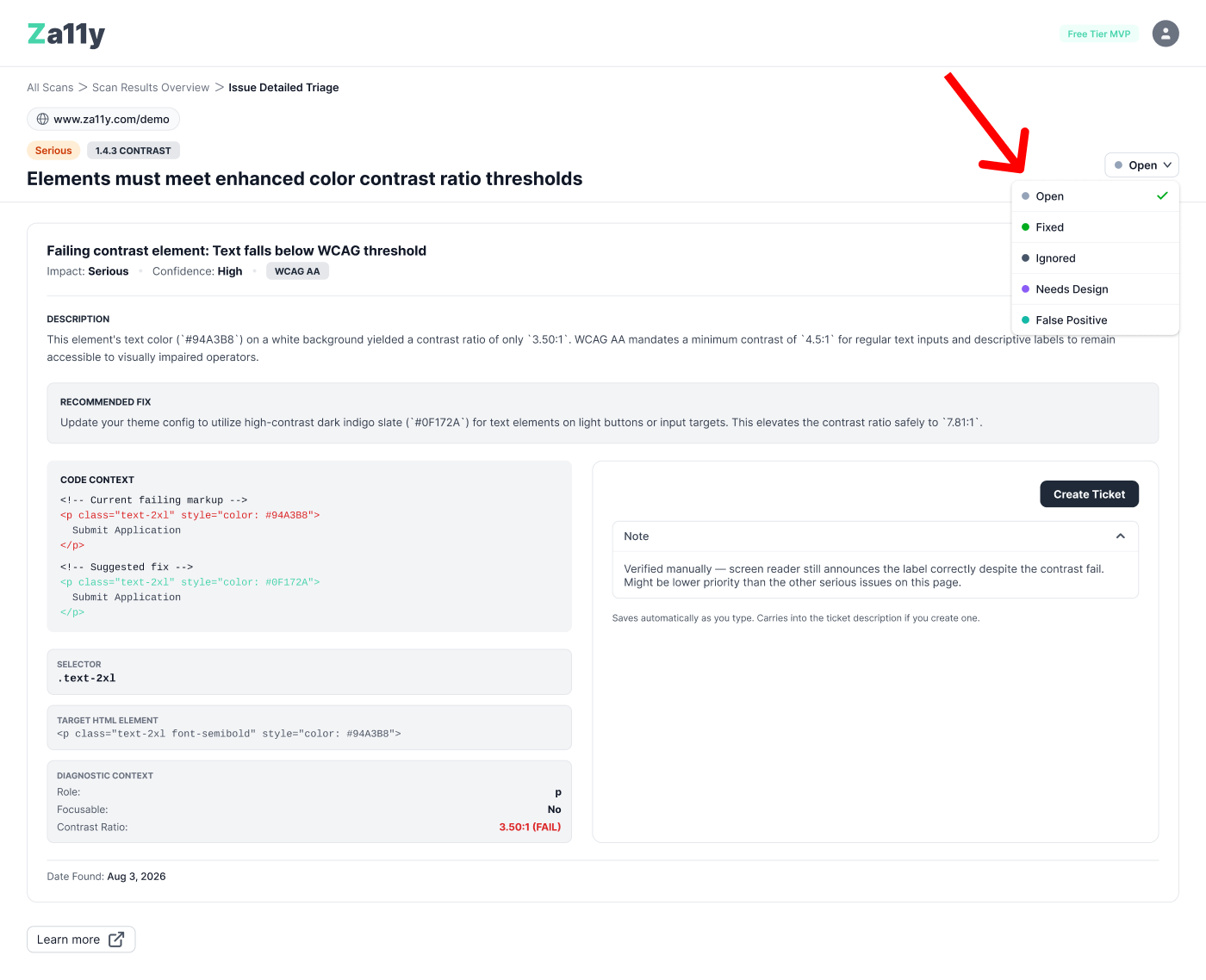
A fixed/not-fixed toggle wasn't enough. Some issues are fixed, some are intentionally ignored, some need a designer, and some turn out to be false positives. Those are different states and the history should reflect that.
Decision
Five states instead of two: Open, Fixed, Ignored, Needs Design, and False Positive. Each gets a label as well as a colored dot, so status never depends on color alone.
Making a card announce that it's clickable
One summary card opened a detail drawer for recurring patterns. Two nearly identical cards on either side of it had no action. Same shape, same shadow, no signal either way. My first fix was a chevron, which helped visually but still didn't explain what the action did.
A chevron can signal that something is clickable. It doesn't explain where it goes.
Decision
I kept the chevron but added visible "View patterns" text, making the action clearer visually and giving it a meaningful accessible name.
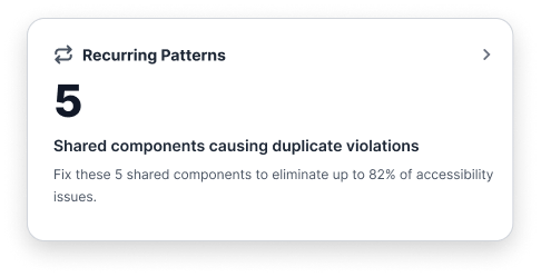
Before: icon only
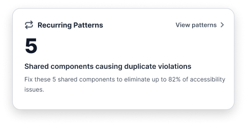
After: icon + visible text
The chevron alone gave no accessible name; pairing it with "View patterns" does.
Catching a color-only signal in an accessibility tool
One flow showed a red "couldn't link ticket" error banner directly above a green "ticket found" success card in the same view. On review, the only thing separating those two states was color.
Decision
Leaving the error banner red doesn't necessarily solve color-only communication if red itself is what communicates “error.” The error should ideally have textual/iconographic identification such as Error: Couldn't link ticket independent of its red treatment.
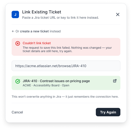
Before: color-only
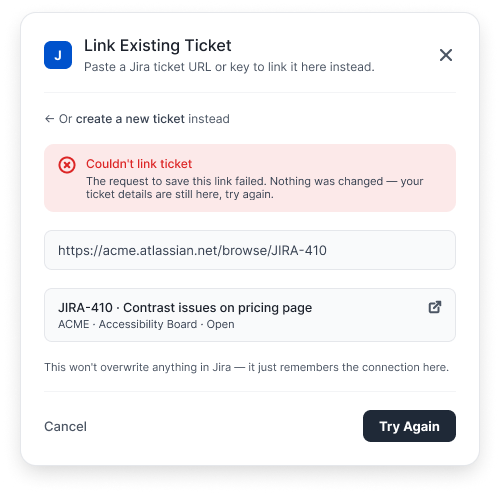
After: neutralized
How I Used Claude Code
I used Claude Code alongside Figma to speed up repetitive changes. After adjusting the "View patterns" link and card padding on one reference card, I used Claude Code to apply the same update across every instance instead of changing dozens of screens by hand.
It turned a repetitive update into a quick, consistent change across the product.
What Still Needs Testing
The dashboard is still a Figma prototype, not a built product. The decisions here reflect my design reasoning and WCAG guidance, but they haven't been tested with actual users yet; especially screen reader users and developers who don't spend their day thinking about accessibility. That's the next real test before any of this becomes a build ticket.
Designing accessibly isn't a checklist you run at the end. It's catching the moment your own interface is about to repeat the mistake it exists to catch.
View the original Za11y Chrome extension.