EV Charging Mobile App

Led the design of a new EV charging ecosystem giving fleet drivers and operators real-time control and visibility into charging activity and costs.

Food & Beverage
Branding
EV Charging Mobile App

Project Overview

Fleet customers had been asking for a dedicated mobile experience to support their drivers, get clearer visibility into charging behavior and manage spending. Competitors were already investing heavily in this space. As the sole UI/UX designer and UX researcher, it was my job to design this new EV charging app from the ground up.

The design effort encompassed everything from early discovery and competitor analysis to final UI delivery, accessibility guidelines, and developer handoff. Collaboration evolved over time, starting with a remote engineering team and later transitioning to an in-house team as development shifted internally.

Requirements

  • Help fleet drivers quickly locate chargers and start a charging session with confidence.
  • Give customers real-time visibility into spending and charger usage across their fleet.
  • Represent charger details clearly and accurately, without overwhelming the user.
  • Meet strict WCAG 2.1 AA accessibility requirements, which was legally necessary for the EU market.

Goals

  • Find a charger with minimal effort
  • Understand pricing and charger capabilities quickly
  • Start and manage a session confidently
  • Access clear records of previous charging sessions
  • The experience had to be intuitive, reliable, and scalable, something customers could trust for critical day-to-day operations.
  • Strengthen competitiveness in the EV charging industry
  • Provide better support for fleet customers
  • Build a strong foundation for future feature growth

Research & Discovery

1

Competitor Audit

I conducted a competitor analysis of leading EV charging apps, reviewing map interactions, charger availability, pricing, session flows, and accessibility. Across the market, most apps overloaded users with technical details, buried pricing, and lacked consistent accessibility. These insights shaped a design approach focused on clarity and ease of use.

2

Internal Insights

Because the app is designed for fleets, I also reviewed customer support tickets, driver pain points, account manager feedback, and engineering/API constraints. This helped clarify what users genuinely needed day-to-day versus what was simply nice to have.

Notes on reservations

Notes on reservations

Sketches for reservations

Sketches for reservations

Design Highlights

Map & Charger Discovery

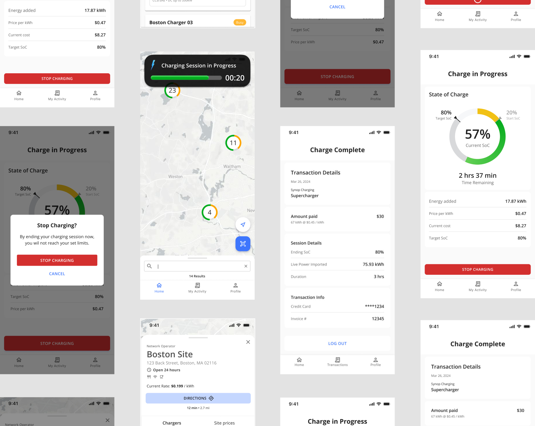
A major goal was helping drivers understand station availability at a glance. I introduced a color-coded status system with WCAG-compliant contrast, making it easy to scan even in bright outdoor conditions. A swipeable bottom drawer reveals key charger and connector details, and the layout adapts seamlessly whether a site has a single charger or more than 20

Charger Details & Pricing

Drivers often feel confused by inconsistent or overly technical pricing. To solve this, I designed a transparent breakdown that clearly labels speed, connector types, and costs—removing jargon that confuses and slows users down. This clarity reduced hesitation and made charging decisions more confident.

Charging Session

During charging, the priority becomes reassurance. I created large, legible progress cards paired with real-time updates on cost, power level, and time remaining. If something interrupts the session, the system responds with direct, actionable guidance instead of generic error codes helping drivers resolve issues quickly.

Driver Spending & History

For drivers and fleet managers alike, understanding usage needed to be effortless. The redesigned history view organizes sessions into clean timelines with straightforward cost and energy breakdowns. This structure supports faster auditing and makes spending patterns easier to interpret.

Home screen map view
Site detail page
Site detail page
Plug in & confirm
Plug in & confirm
Loading Screen
Loading Screen
Charge in progress
Charge in progress
Dynamic island notification
Cancel charging
Cancel charging
Charge complete
Charge complete

Launch & Outcomes

The app successfully launched in both the US and EU markets.

Key outcomes included:

  • A clear, modern charging experience that supports fleet drivers
  • Improved transparency for customers tracking charging activity
  • A flexible design foundation for adding new features over time
  • A shared accessibility standard adopted by both design and engineering

Accessibility

I created accessibility guidelines that all teams could follow, including:

  • WCAG 2.1 AA color contrast standards
  • Minimum target sizes and safe-tap areas
  • Consistent structure and hierarchy for screen readers
  • Accessible error messaging

These guidelines were used during design, development, and QA.

Cross-Functional Collaboration

Throughout the project, I collaborated closely with product and both the remote and later the in-house engineering teams.

This included:

  • Walking through complex edge cases
  • Designing with API behavior in mind
  • Providing detailed component specs
  • Sharing accessibility expectations early
  • Clarifying flows, error states, and interaction details

My goal was always to make implementation as smooth and predictable as possible.

I created reusable components and updated our design system to keep the UI consistent and dev-ready.

Impact & Results

0
WCAG compliance
Improving color contrast and visibility
0
Error reduction
Cut number of unclear or dead states
0
Launch Complete
% of MVP requirements
0
Reduction in steps
Improved task completion rate

Reflection & Future Opportunities

If I were to continue expanding this product, I’d focus on:

  • Route planning integrations
  • More personalized charging recommendations
  • Richer session analytics for fleet managers
  • Additional accessibility improvements for cognitive load
  • Continued optimization of map performance